The Hoffbrau
The Hoffbrau
After extensive field research and restaurant studies, I re-invented designs for this classic Austin steakhouse and made renovations to its interior. With this 1900’s-born steakhouse came the challenge of improving the old restaurant without ruining its nostalgic charm.
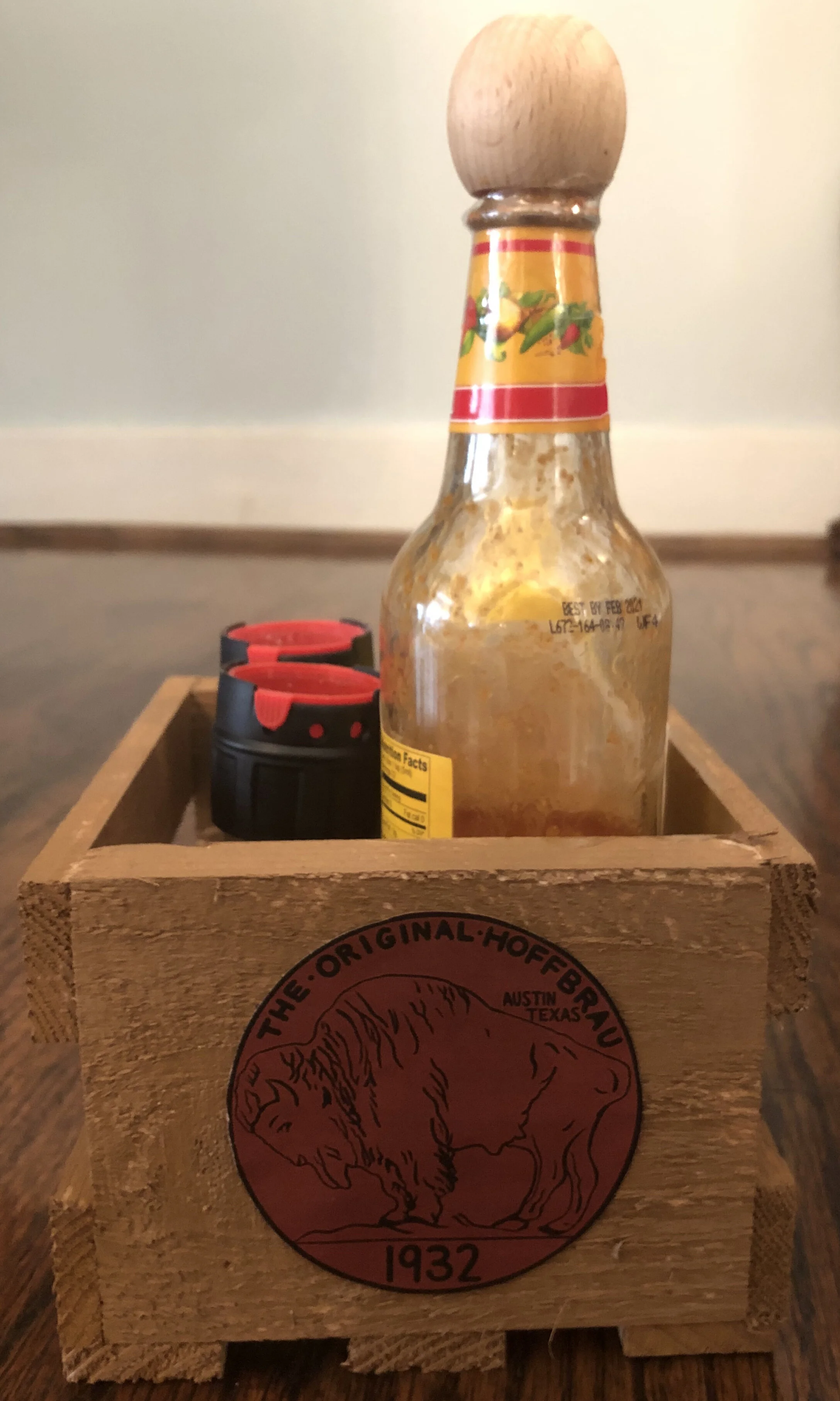
Photos of existing restaurant, below.


Hover over images in slides below for text.descriptionn.

The Hoffbrau was lacking a consistent primary typeface for its name. Establishing the primary typeface allows for unity and more opportunities to create other designs and create a cohesive brand.

Sign.

Hoffbrau sign in context. I created this sign based off the actual sign that exists outside the restaurant. This design could be used on the back of the historical paper handout. The next photo shows the front of the paper handout.

The old history paper handout was poorly designed, difficult to read, and bland. This new paper handout is visually appealing, and serves as a keepsake of some means that is more inspiring and celebratory than before.

When The Hoffbrau first opened, they sold beers for a nickel. Inspired by the retired buffalo nickel, I created this logo. It reflects their history, while also bringing a sense of simplicity and modernity. It is used in context on the paper handout in the previous photo.

Buffalo nickel logo used in context. In the restaurant now, condiments are randomly placed on the tables unkept. This wooden container I created is inspired by beer crates and branded with the buffalo nickel logo. This change in container adds order and brand elements to the table while maintaining simplicity, something that the current restaurant is lacking.

Frontal view of condiment crate.

Buffalo nickel logo used as a profile logo on Google Maps.

Buffalo nickel shown on match boxes. The idea here was to create a keepsake item that customers would want to hold onto to remember this historical restaurant.

The Hoffbrau opened during The Prohibition, so the owners at the time opted to illegally sell beer for some time. One means of this was keg beer, which was home-brewed and offered to customers for a nickel a glass. I created this nostalgic logo inspired by this story.

Keg logo and sign logo used to create a t-shirt.

I created this logo because food, and steaks in particular are so important to this restaurant and their customers. They started selling steaks shortly after opening when a soldier proposed the idea. The old 2-steak skillet they used before still resides behind the bar in the restaurant. I wanted to incorporate steak in the branding without making it to gory, and offering a rustic, simple appearance.

The menu currently is a piece of paper in a plastic casing. This new menu uses a similar typeface as the simple Hoffbrau sign logo, and maintains a grungy look. The steak logo is used in context, too.

Rather than a plastic case, I proposed using an old wooden picture frame to hold the menu for each table. This way, the menu remains simple and only one per table, while also contributing more to the restaurant’s brand.

The walls in the restaurant are very plain. I created this simple wallpaper to be used on a small part of the restaurant’s wall. The beer bottle pattern can could also be used elsewhere.

I re-did the back kitchen wall. The case holder for the condiments became a hollowed-out guitar with shelves made out of the guitar’s neck. The new “Kitchen” sign was created with a typeface like the Hoffbrau’s sign logo. On the right is the new beer bottle wallpaper I created used in context. These new changes remain simple, but add elements to reflect the restaurant’s story and contribute to its historically fluid brand.

Light-up sign created using the Hoffbrau’s sign typeface. The light-up sign is like common beer signs in bars.

Light-up sign used in context.

The renovated bar now has the grooved iron front wall to add variation in material. I added the longhorn horns centerpiece and a new level of alcohol on top to add movement. The surface of the bar, now black steel, ties into the color scheme of the restaurant. I changed the Hoffbrau sticker that was on the mirror to match the sign outside of the restaurant.


